
Inquiries
E. alejandrafernandez.pro@gmail.com
IG. alejandrafernandezramos.work
E. alejandrafernandez.pro@gmail.com
IG. alejandrafernandezramos.work
Project Overview
Year ✷ 2025
Industry ✷ Architecture
Client ✷ Estudio Quintás
Photographer ✷ @Peritas.foto
Role ✷ Full Ownership
Scope ✷ Brand Strategy / Brand Design / Web Design
Industry ✷ Architecture
Client ✷ Estudio Quintás
Photographer ✷ @Peritas.foto
Role ✷ Full Ownership
Scope ✷ Brand Strategy / Brand Design / Web Design
About
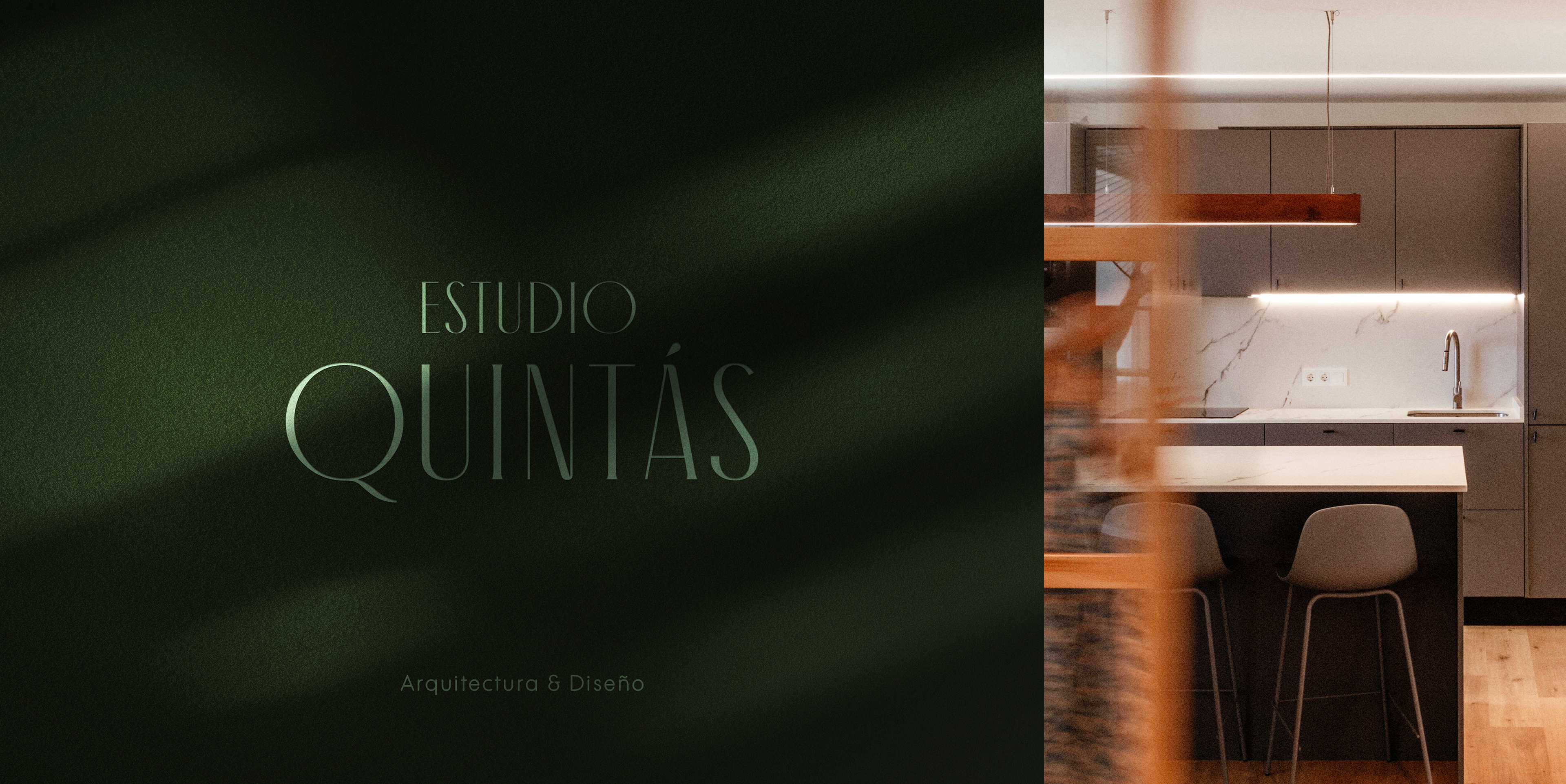
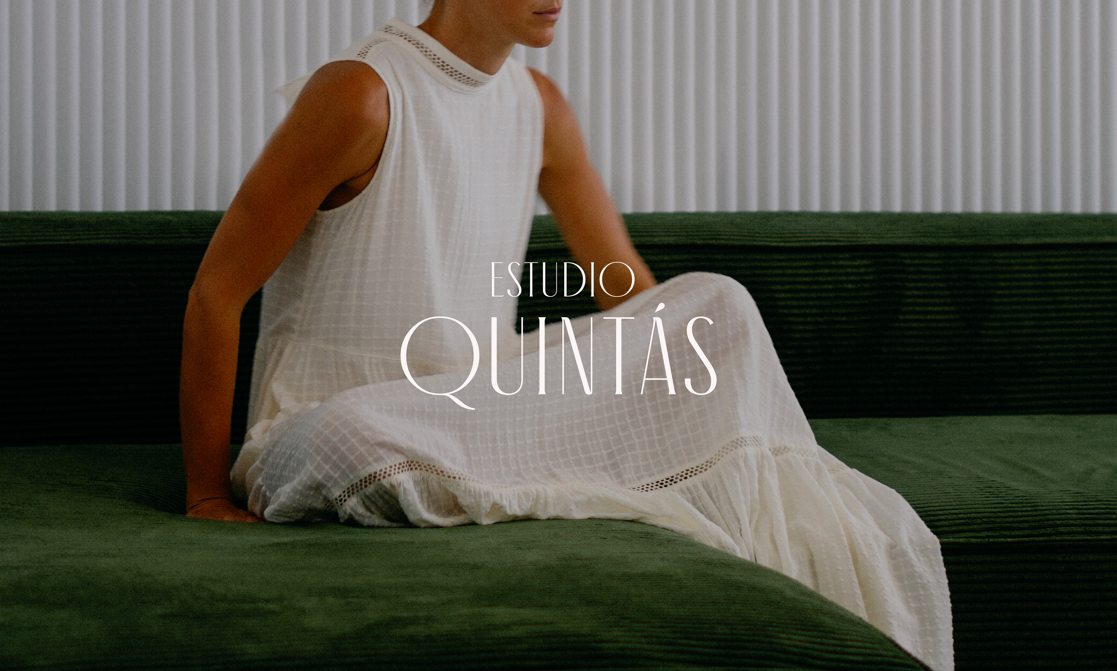
Estudio Quintás is a brand project I developed end-to-end, from strategic positioning to visual identity and digital presence.
Founded in 2022 by architect Violeta Quintás, the studio was born as an independent practice focused on continuing her professional growth through collaboration with other passionate professionals in the sector.
Founded in 2022 by architect Violeta Quintás, the studio was born as an independent practice focused on continuing her professional growth through collaboration with other passionate professionals in the sector.
The challenge
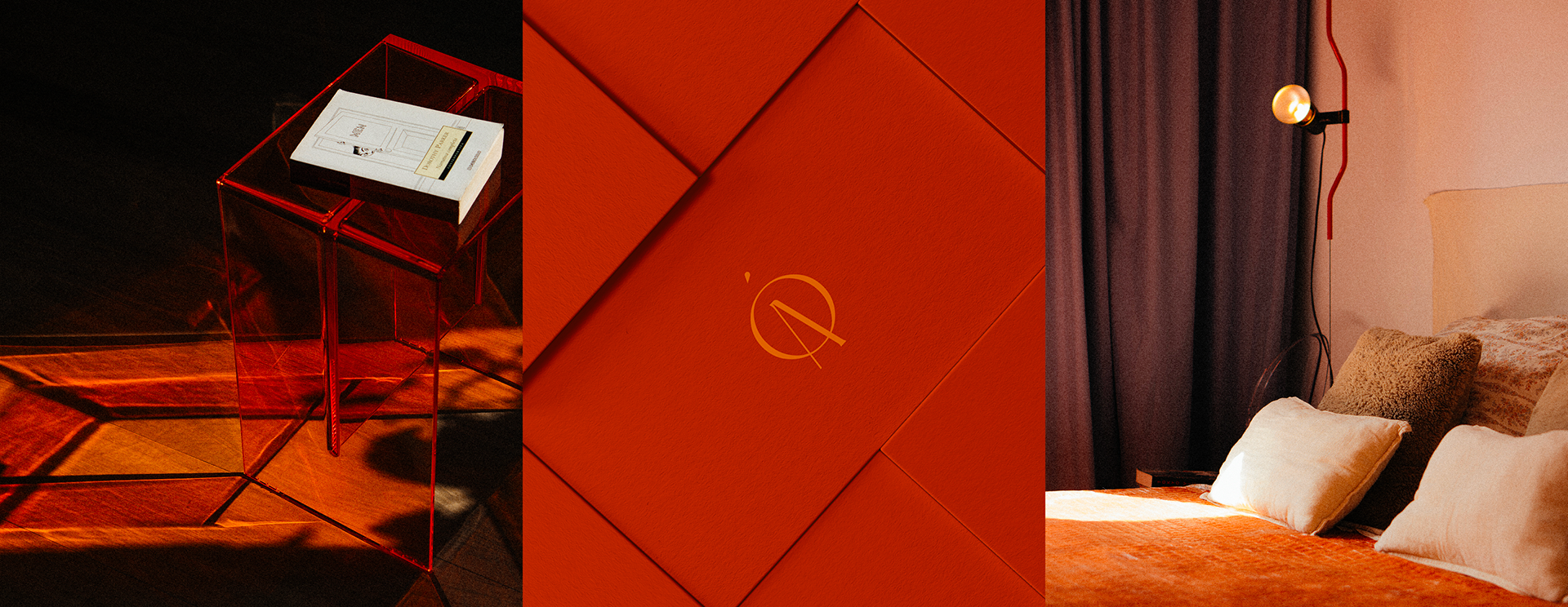
At the end of 2023, Violeta contacted me with a clear goal: to build a strong brand from the ground up, including its positioning, brand design, and digital presence. The aim was to create a website that showed her vision and professional style. She wanted a brand with character that could express how she understands and designs spaces. A minimalist, clean style, with bold pops of color that reflect her architectural sensitivity, something pure, but with soul.
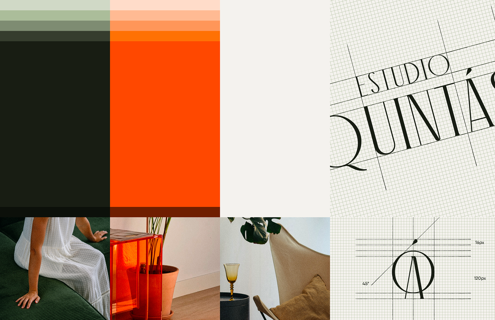
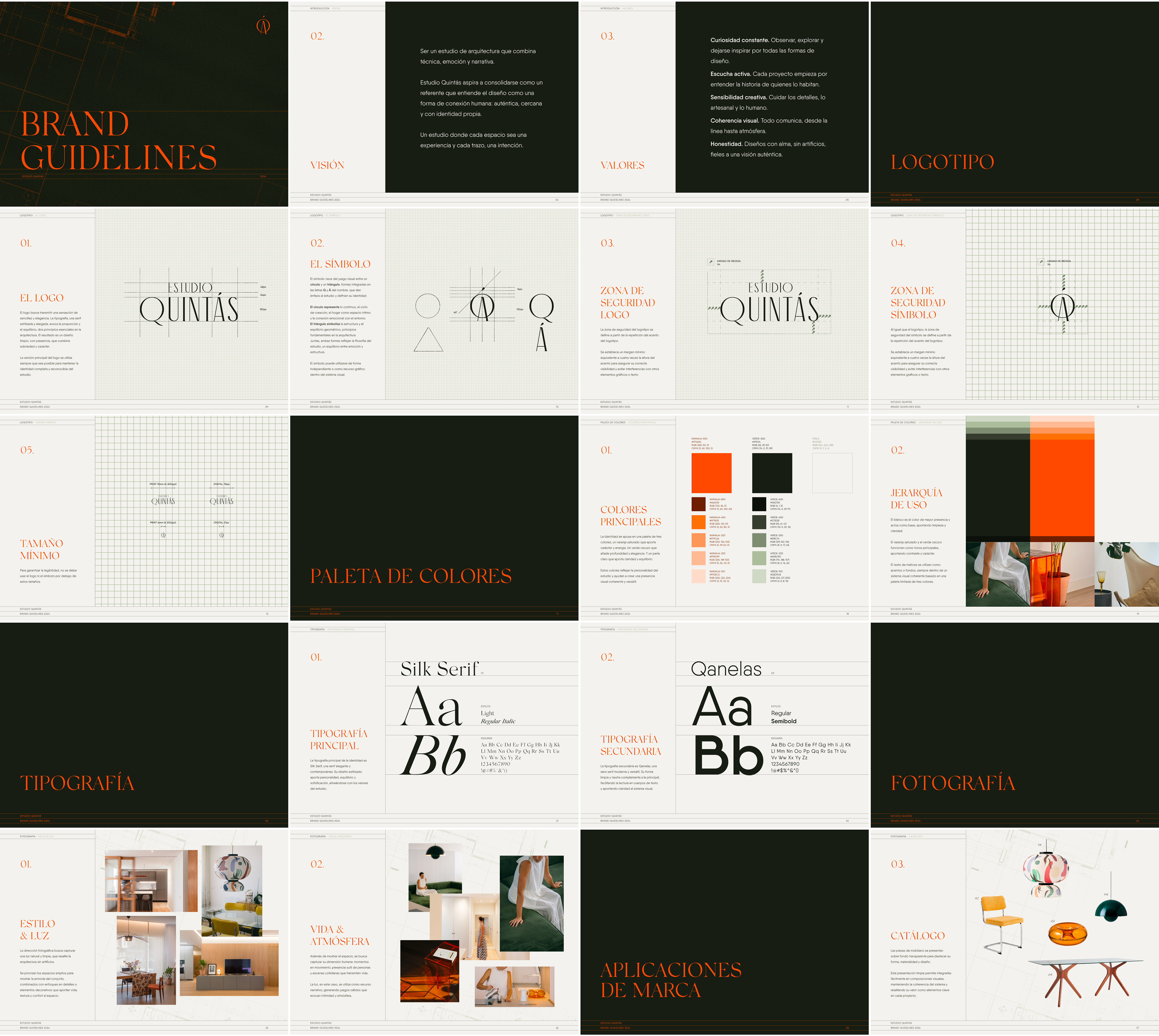
Visual Identity Rationale
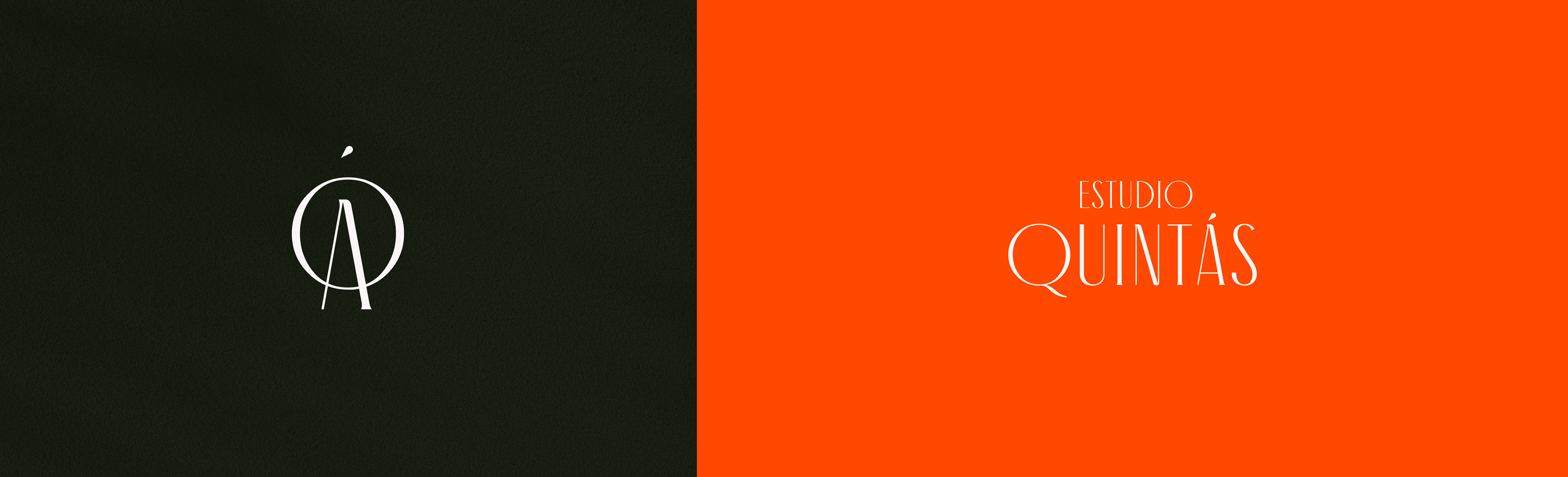
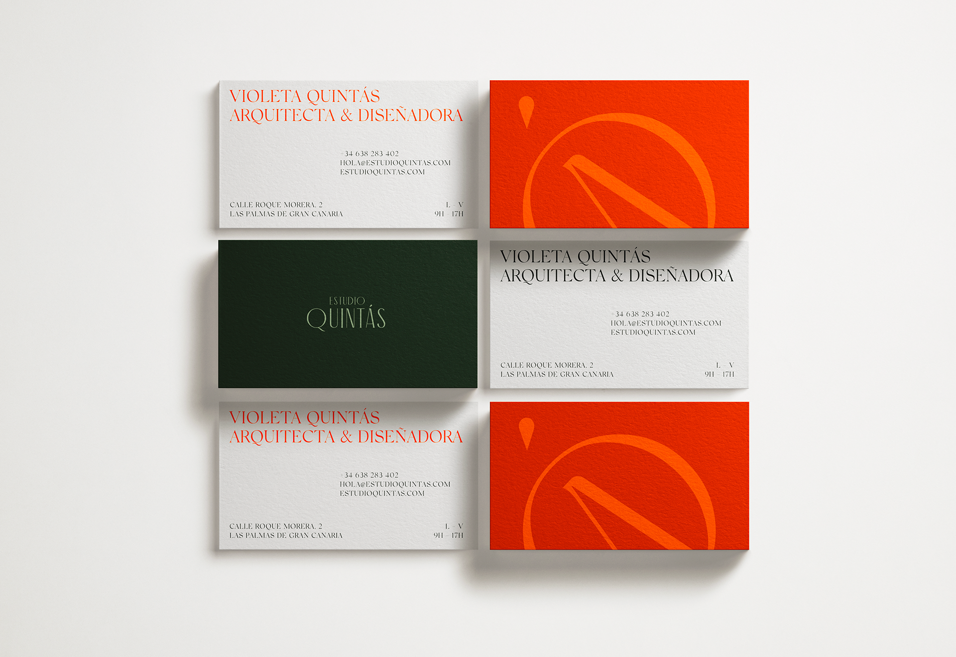
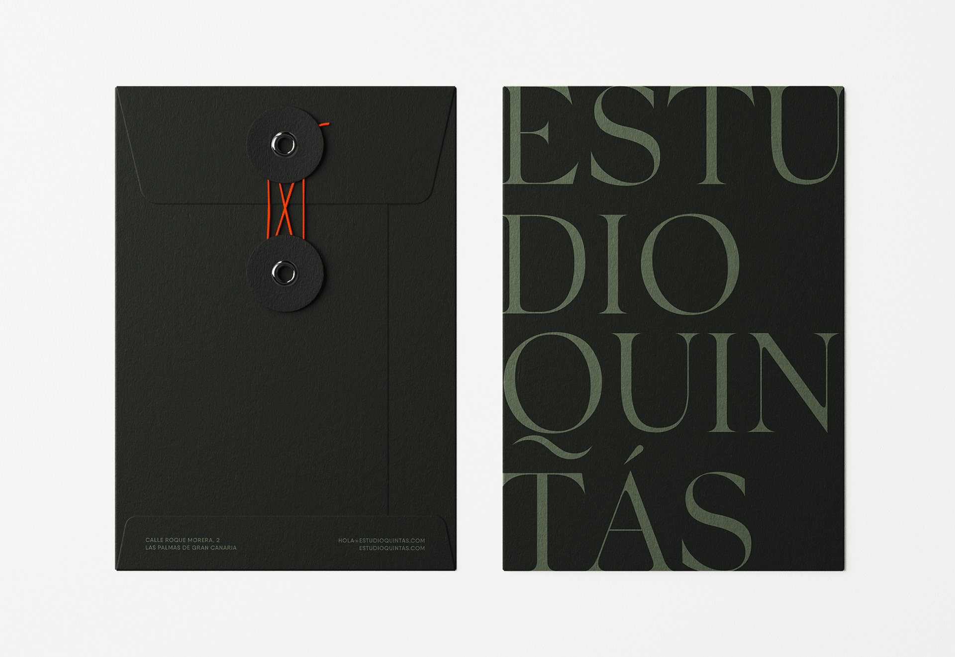
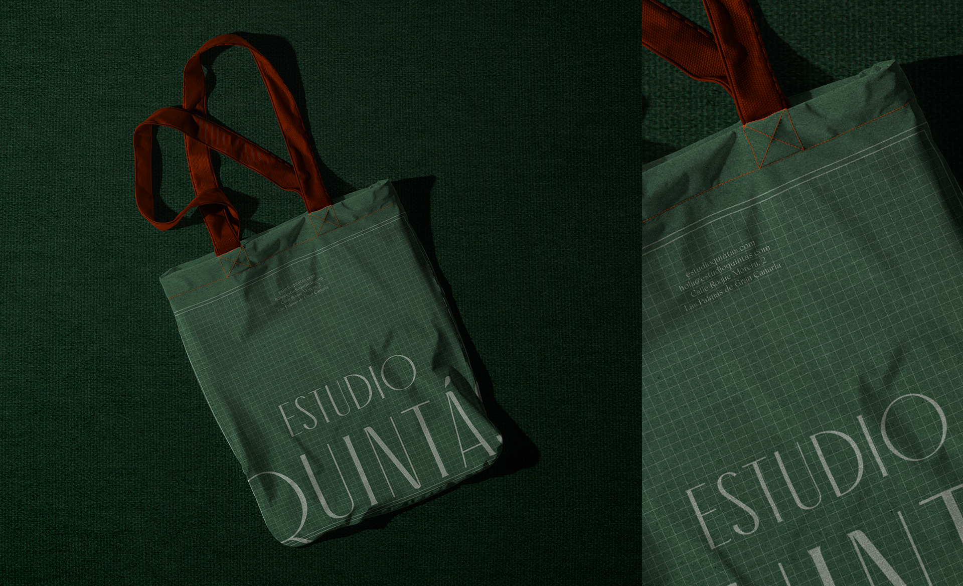
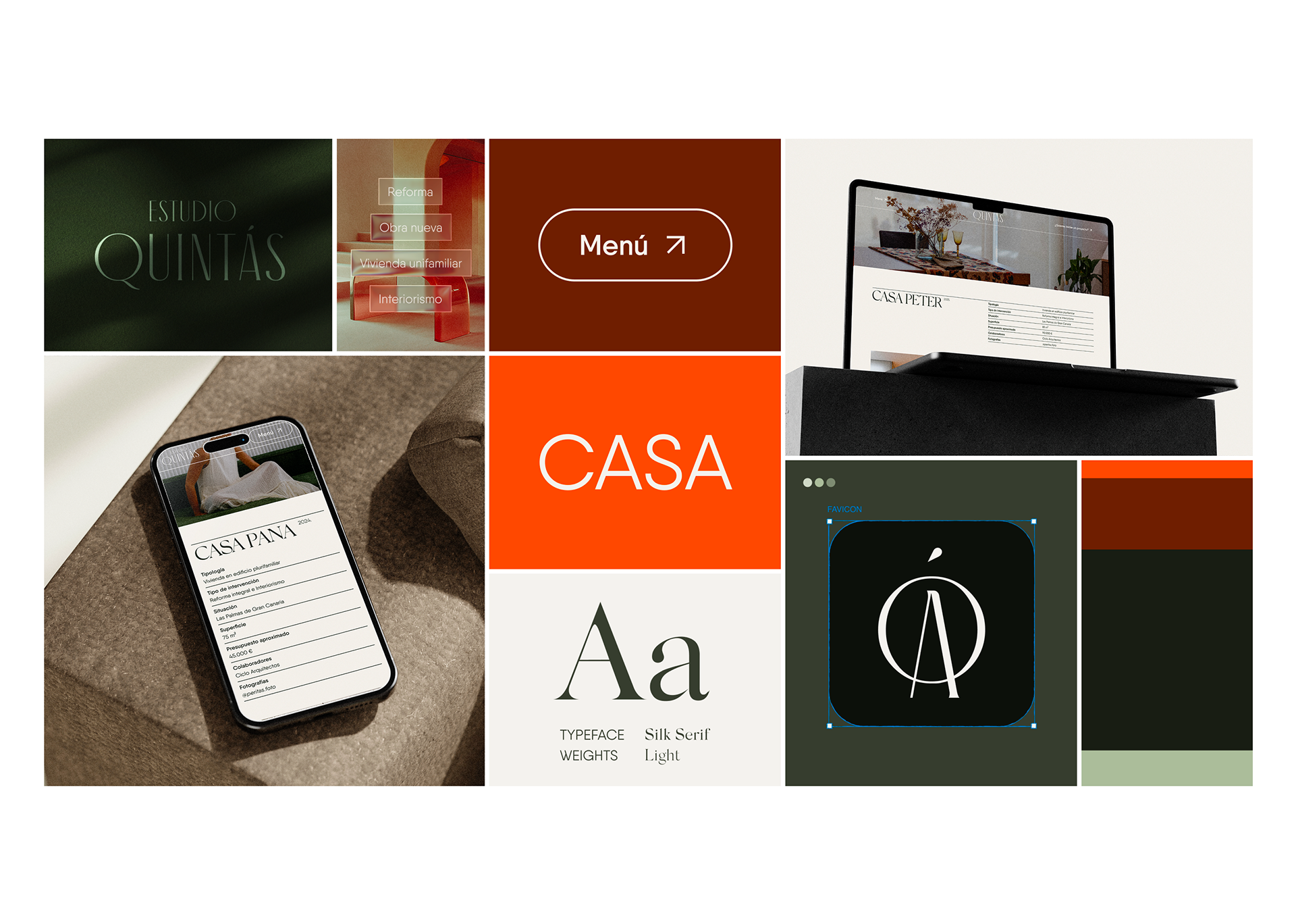
Logo & Symbol
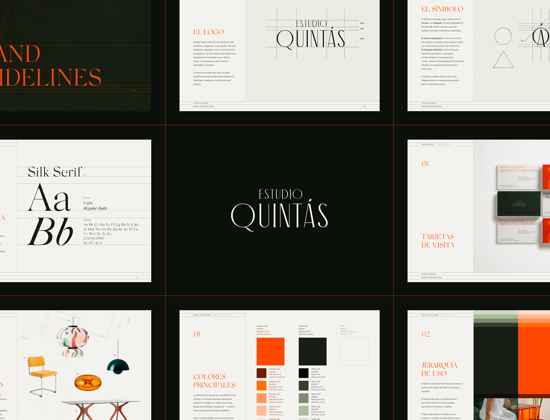
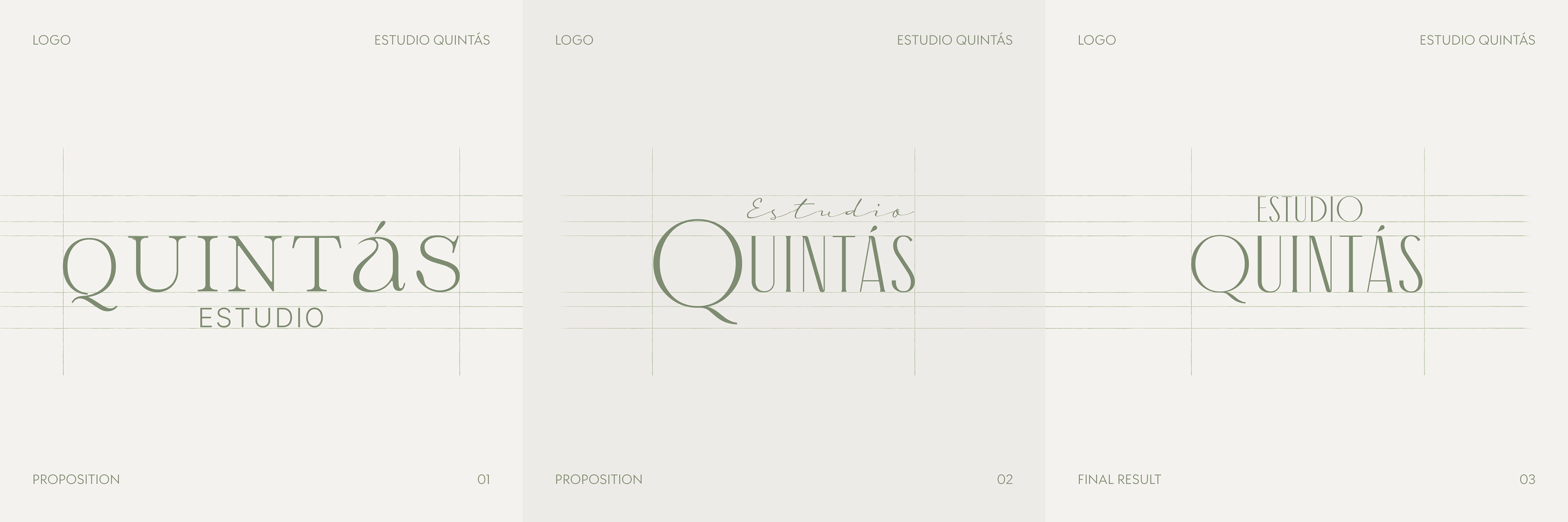
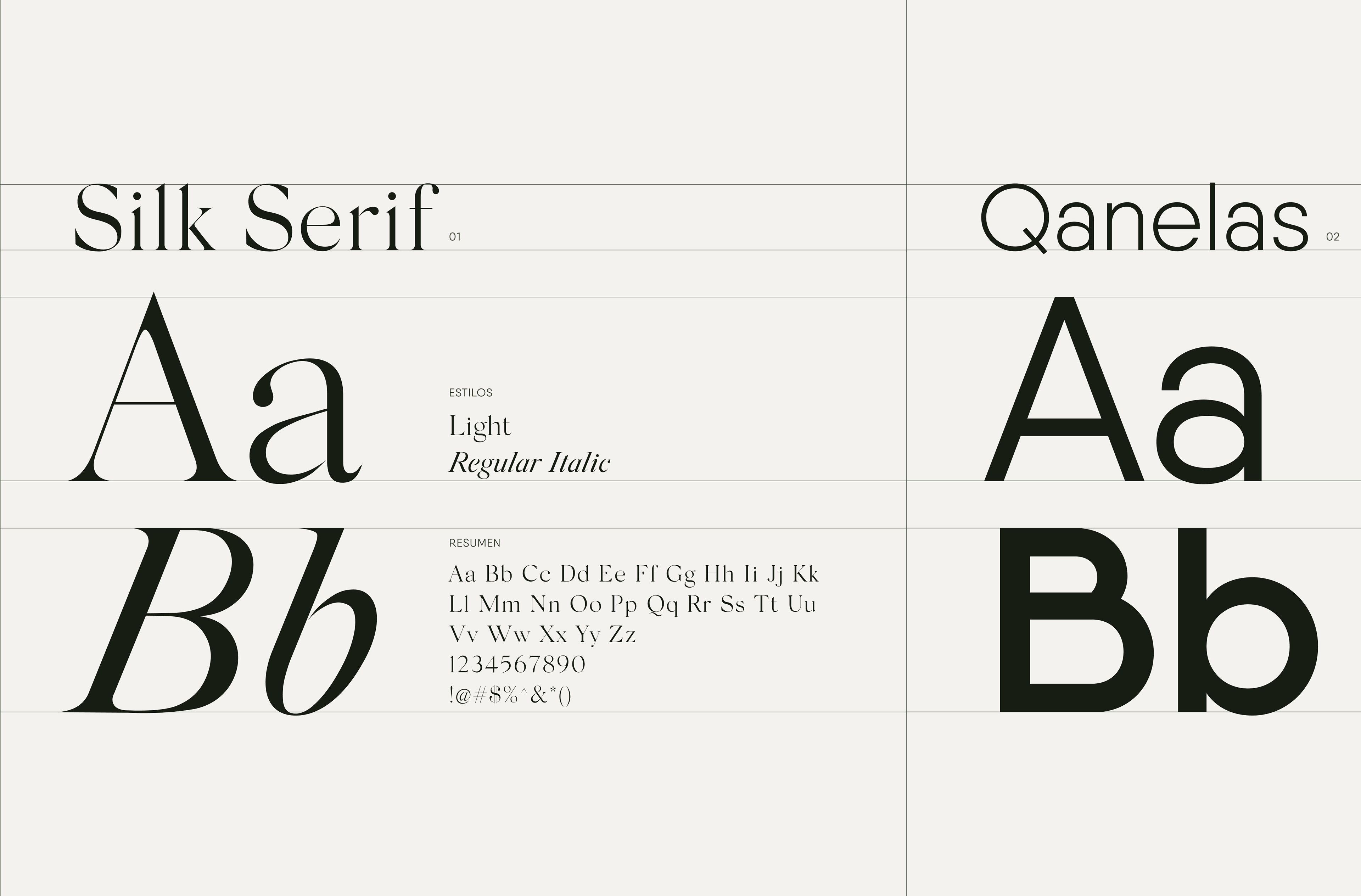
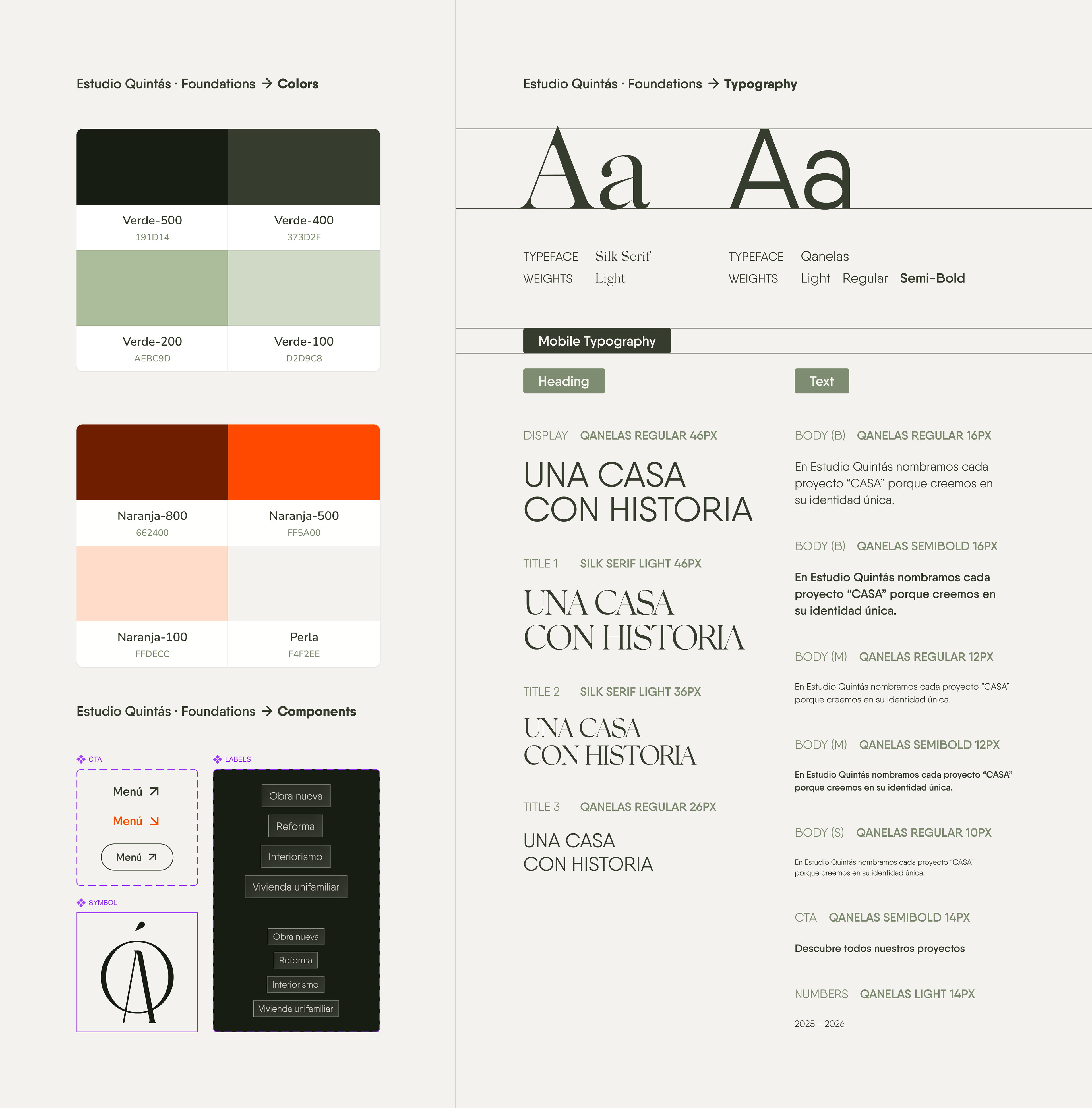
A balanced logo that uses an elongated sans serif typeface. The main typeface, Antiga Regular, brings a touch of elegance. It is clear and simple, offering personality without losing simplicity.
The symbol comes from the play between the Q and the Á, evoking two geometric shapes (a circle and a triangle) with personal meaning for Violeta. These shapes, which have always been important to her, are integrated into the letters to emphasize the studio’s name and give it meaning.
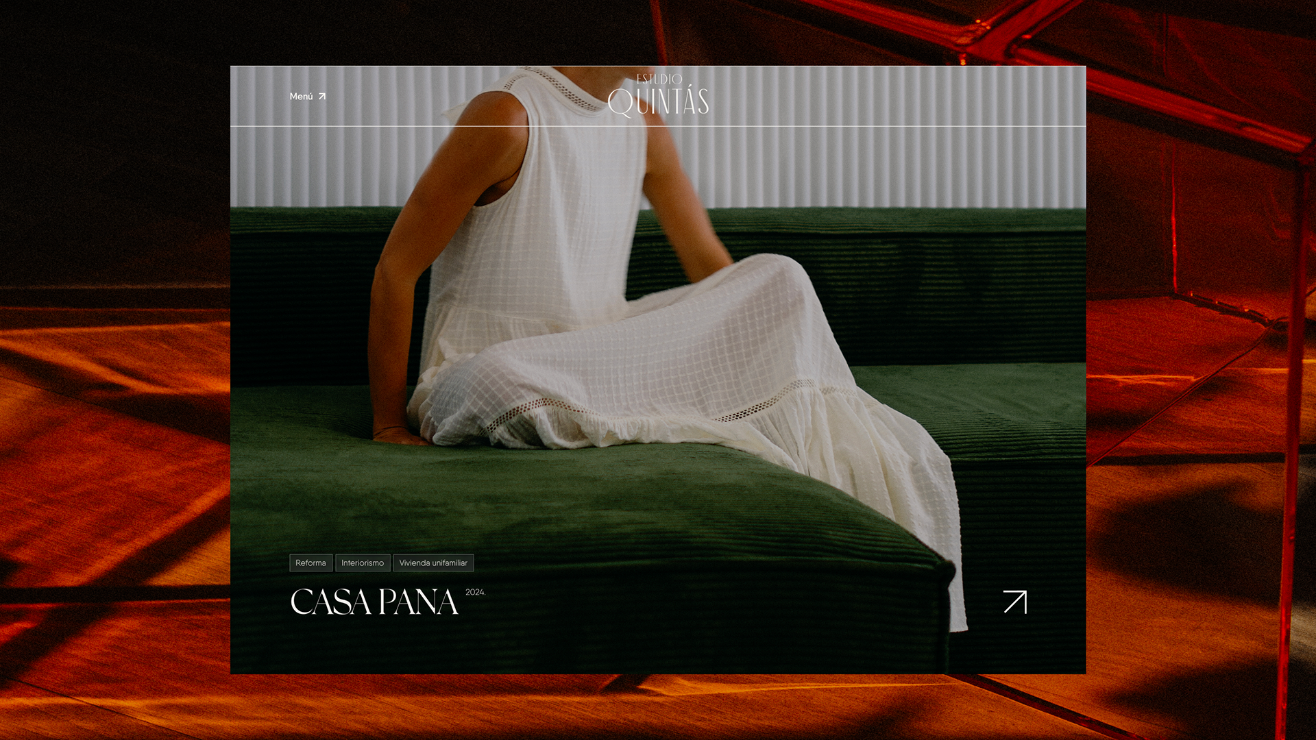
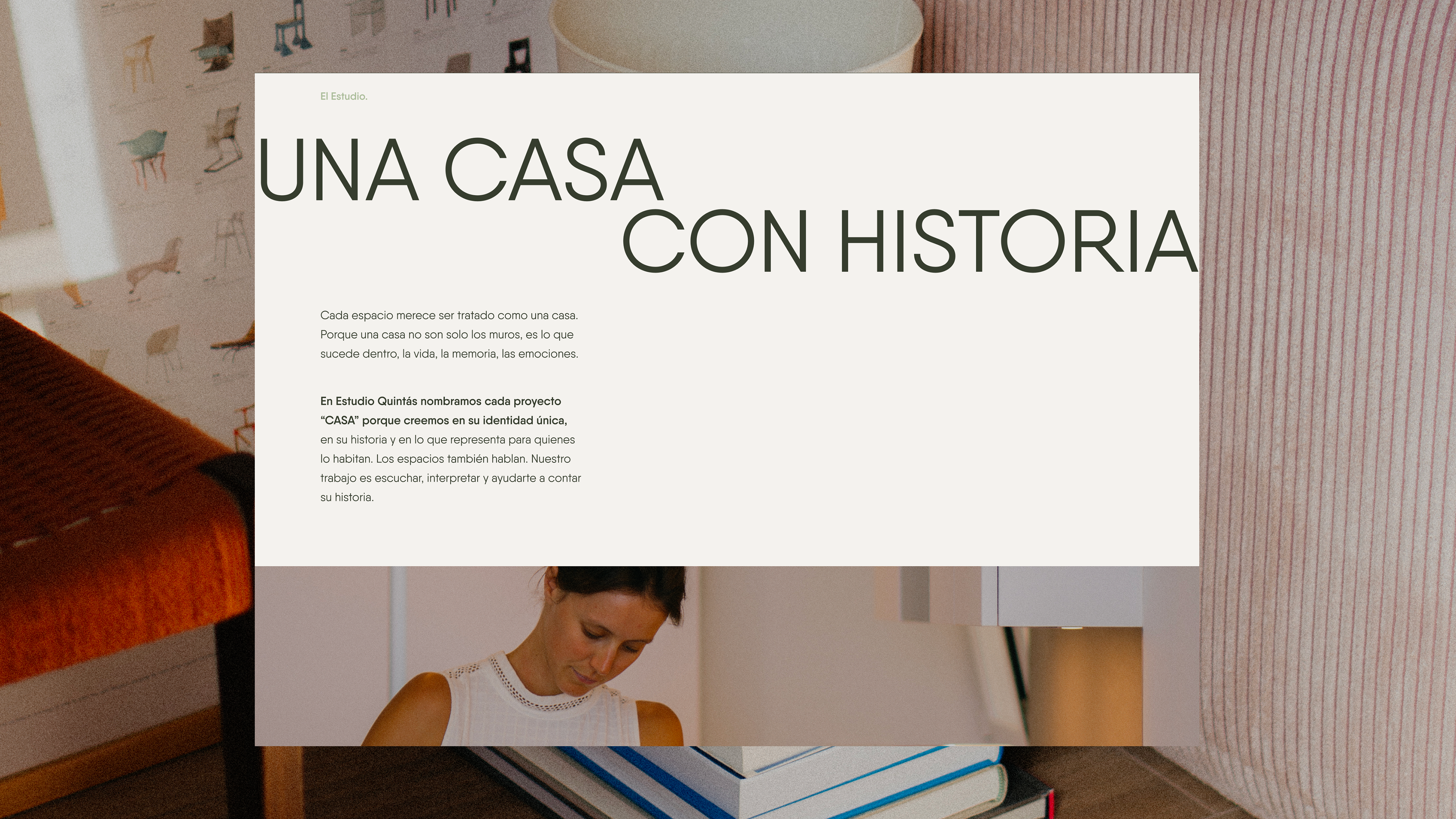
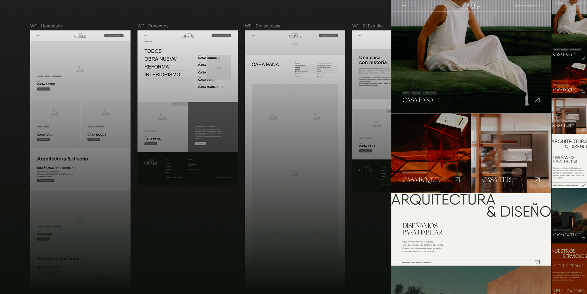
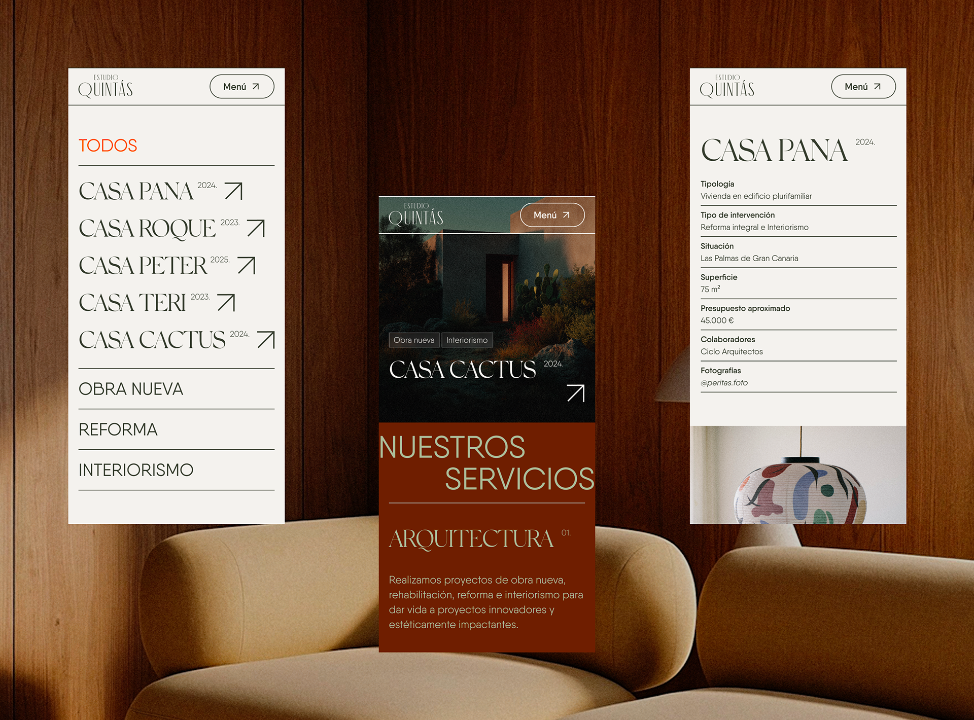
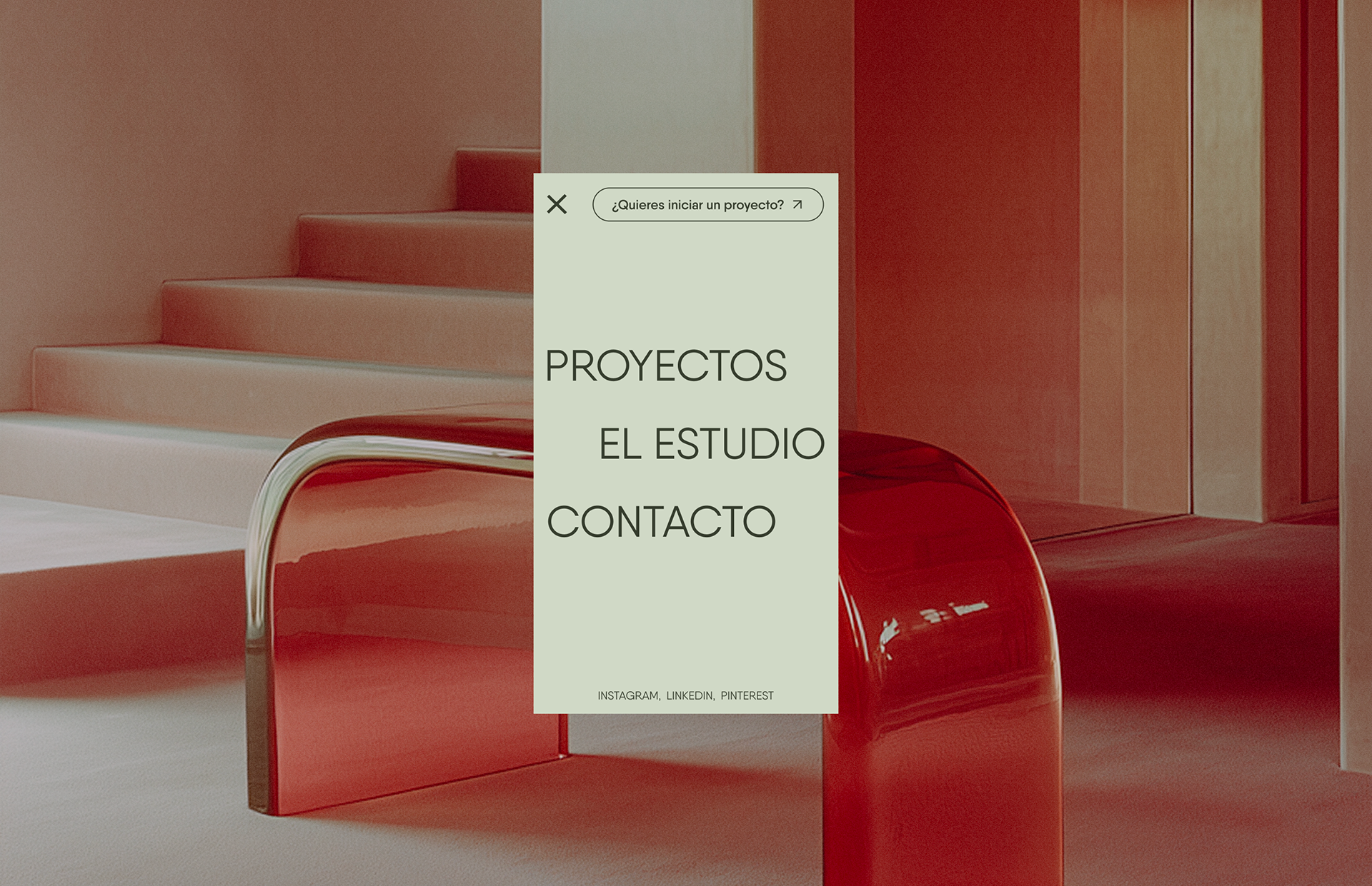
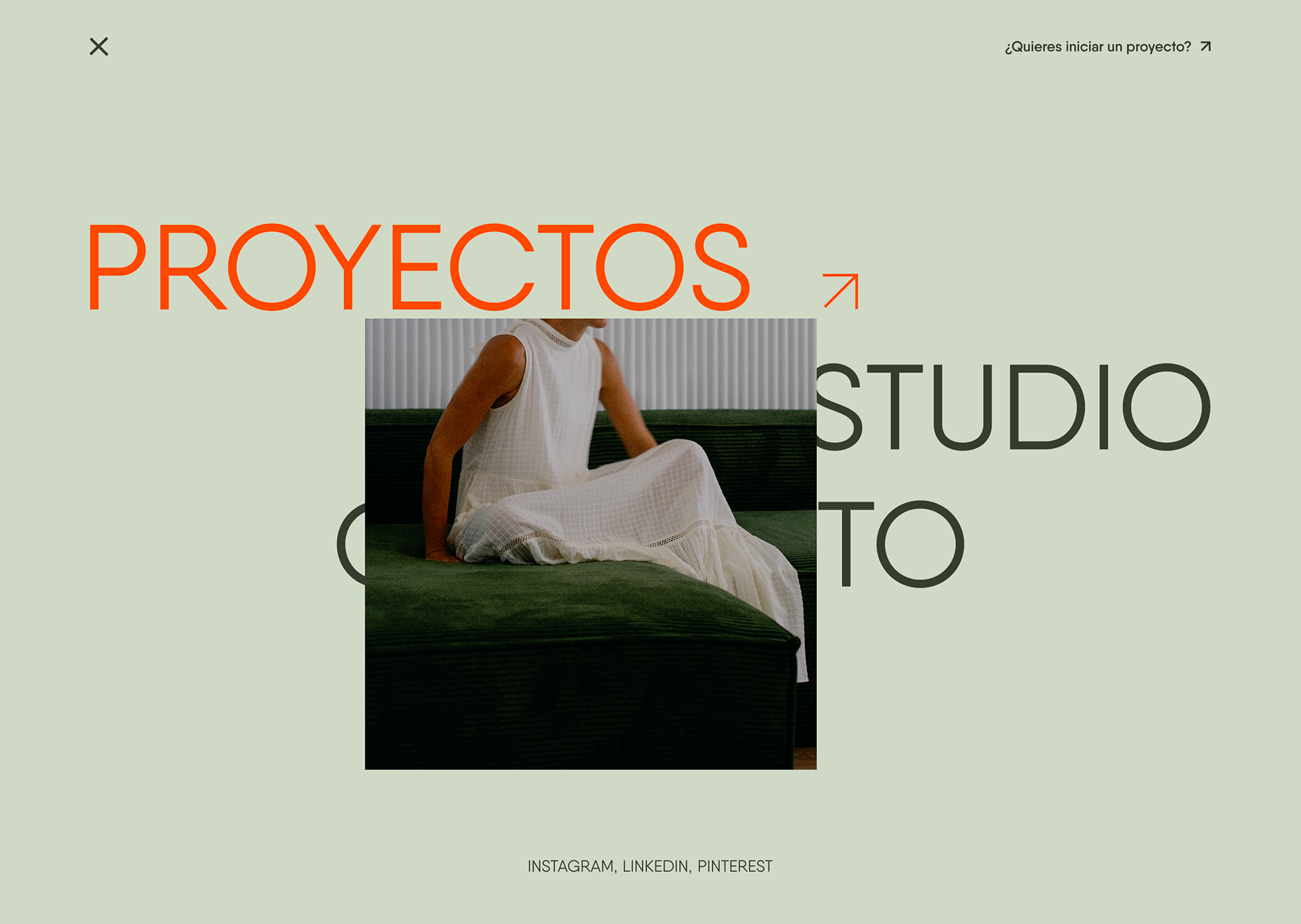
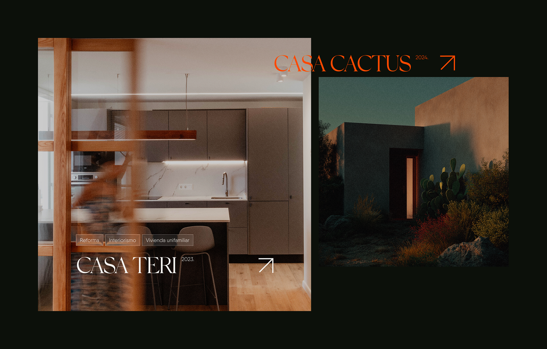
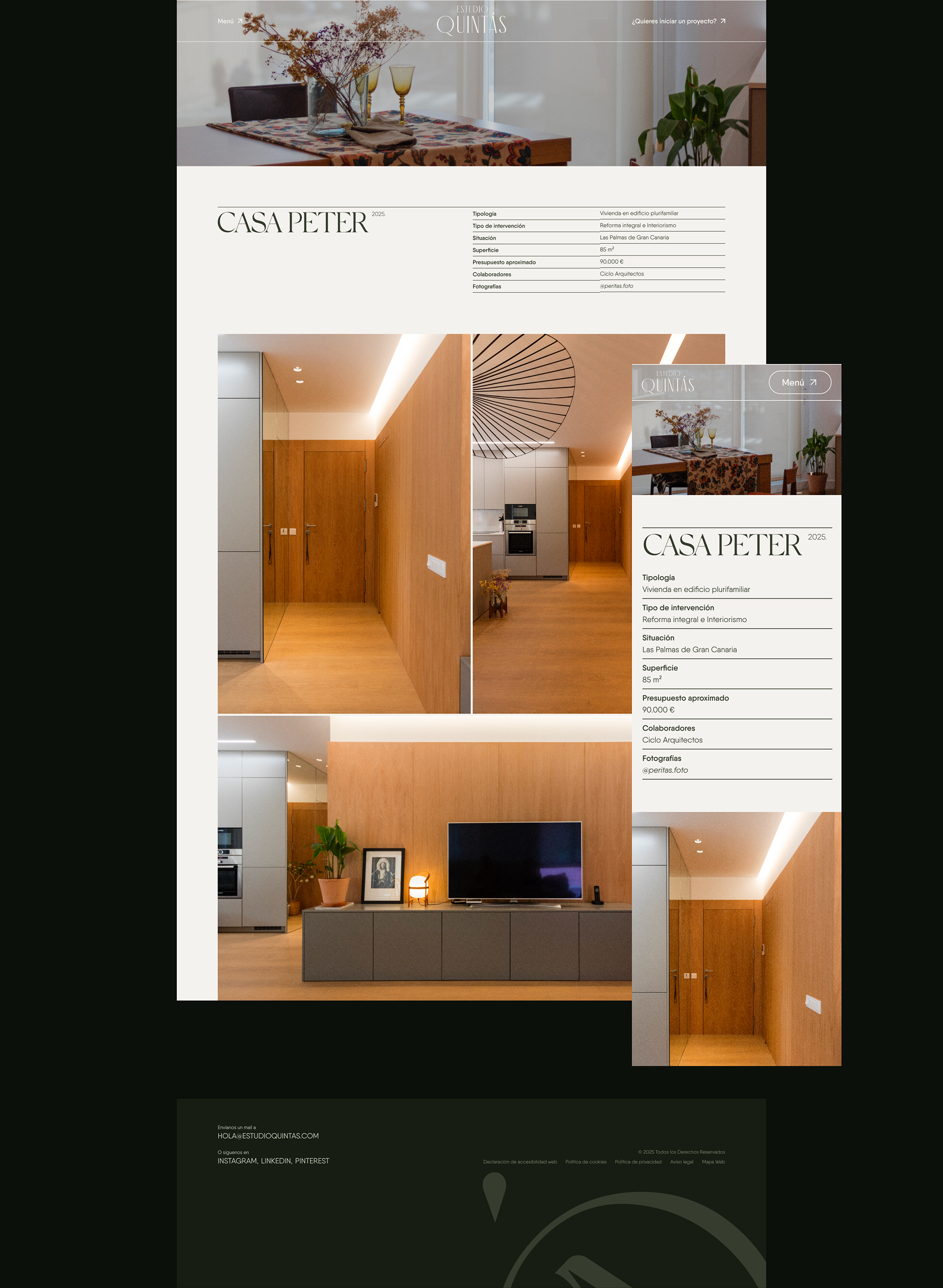
The website
After having defined the visual identity of Estudio Quintás, the next step was to bring it to life online. I focused on creating their portfolio-driven website, a clean, visual showcase where imagery takes center stage to reflect the beauty and precision of their architectural and design work. The goal wasn’t complex navigation, but rather a seamless experience that communicates expertise, services, and the studio’s unique vision to potential partners, new clients, collaborators, and anyone seeking high-quality spatial design.
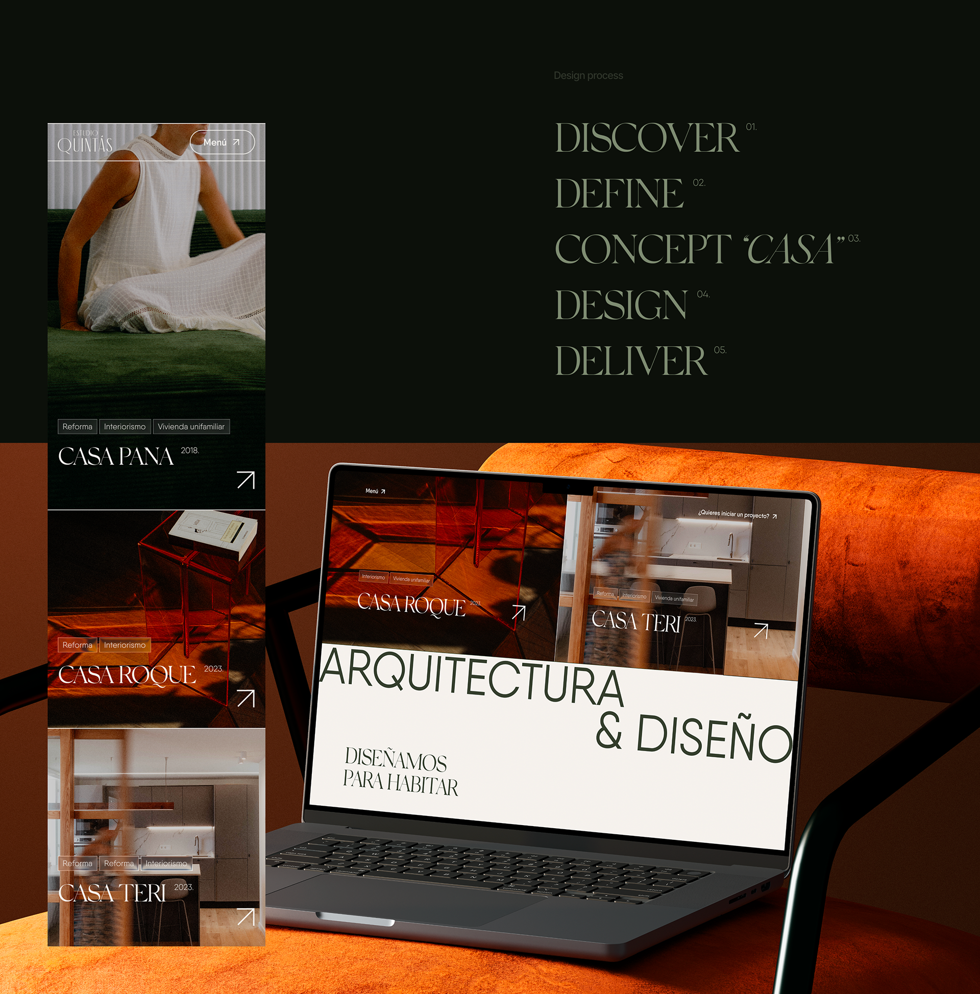
Discover
I began by understanding the essence of the studio, its services, personality, audience, and business goals. I analyzed references, competitors, and the current market positioning to determine how a digital presence could best support the studio: a portfolio-oriented website that elevates their visual work while clearly communicating the strategic value behind each project. During this phase, I uncovered a strong narrative foundation: the concept of “CASA” as identity and storytelling.
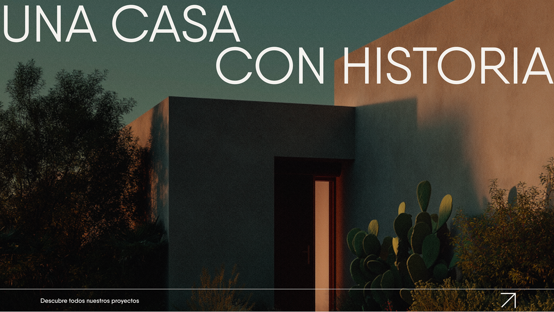
Concept “CASA”
I positioned the “CASA” concept as the core narrative of the website, emphasizing how each project carries its own story, identity, and purpose.
I translated this into content structure, ensuring the tone feels warm, human and story-driven while visually refined.
I translated this into content structure, ensuring the tone feels warm, human and story-driven while visually refined.
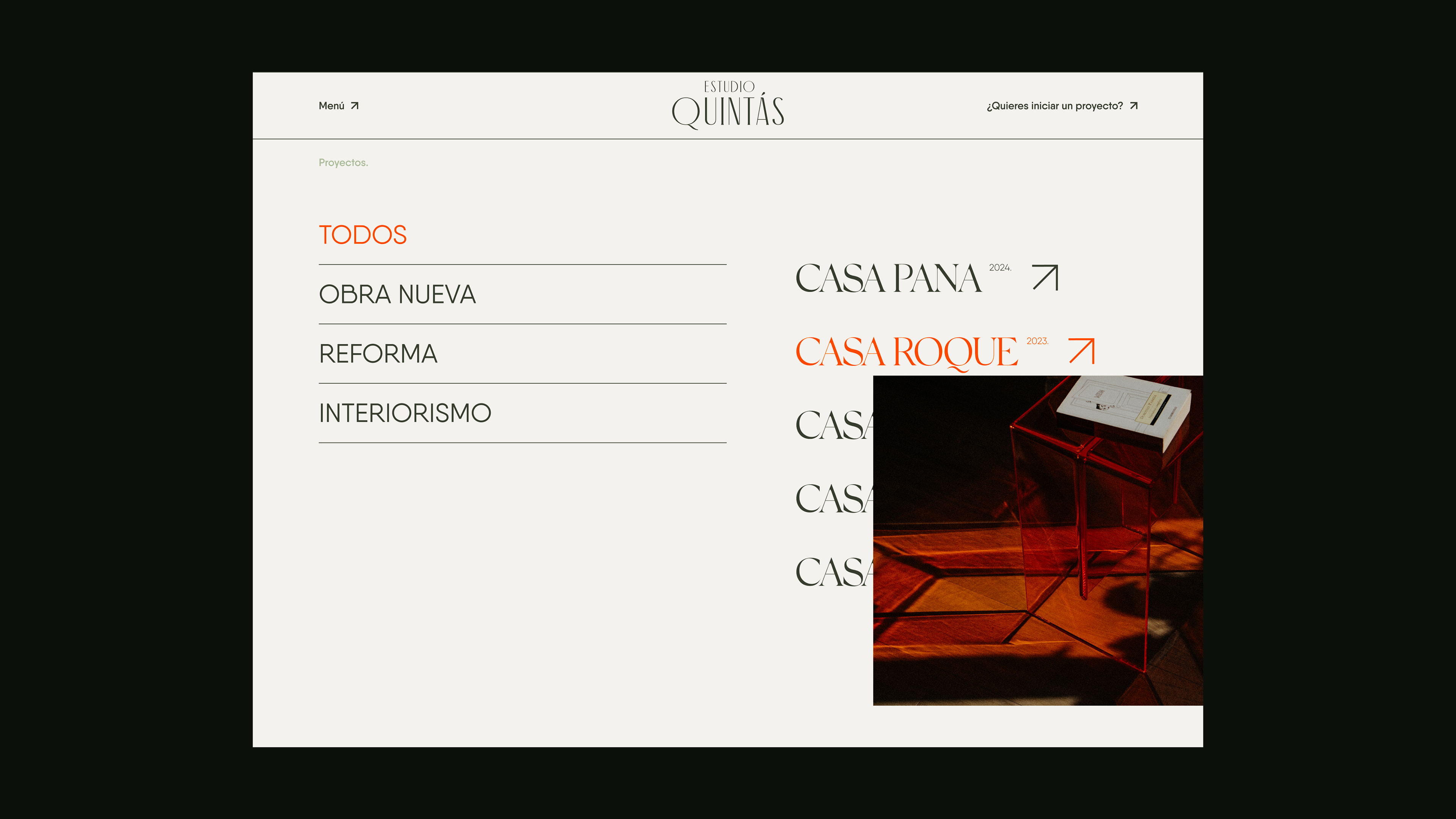
Design
I developed wireframes and interaction flows focused on simplicity and balance, then crafted a clean, minimal interface that lets images take center stage. Large visual formats, generous white space, and a strong grid system enhance the premium feel of the studio’s work.
Typography supports a seamless reading experience, guiding users to appreciate the elegance and intentionality behind each space.
Typography supports a seamless reading experience, guiding users to appreciate the elegance and intentionality behind each space.
Deliver
Through iterative prototyping and refinement, we launched an elegant, user-friendly website designed to build trust, a polished digital showcase that presents Estudio Quintás as a studio of sensitivity and purpose.
I delivered a fully responsive portfolio website that:
· Represents the studio with a distinctive, cohesive identity
· Serves as a powerful presentation tool for clients, partners, and collaborators
· Highlights the studio’s expertise in architecture, interior design, branding, and 3D visualization
I delivered a fully responsive portfolio website that:
· Represents the studio with a distinctive, cohesive identity
· Serves as a powerful presentation tool for clients, partners, and collaborators
· Highlights the studio’s expertise in architecture, interior design, branding, and 3D visualization

Estudio Quintás Brand Design + Web Design 2025


