
Inquiries
E. alejandrafernandez.pro@gmail.com
IG. alejandrafernandezramos.work
E. alejandrafernandez.pro@gmail.com
IG. alejandrafernandezramos.work
Project Overview
Year ✷ 2025
Industry ✷ Food & Beverage
Role ✷ Full Ownership
Scope ✷ Brand Strategy / Brand Design / Concept Development
Industry ✷ Food & Beverage
Role ✷ Full Ownership
Scope ✷ Brand Strategy / Brand Design / Concept Development
About
K-AFE is a Korean café that blends traditional flavors with modern twists, offering a selection of beverages and snacks in a warm, inviting atmosphere. My goal was to explore how a strong, contemporary visual identity could reflect this balance between heritage and modernity, allowing the café to stand out in an increasingly competitive market.
K-AFE never commissioned this work, curiosity did. This case study tells the story of how I approached the challenge, experimenting with design, branding, and atmosphere to imagine what this café could become.
K-AFE never commissioned this work, curiosity did. This case study tells the story of how I approached the challenge, experimenting with design, branding, and atmosphere to imagine what this café could become.
The challenge
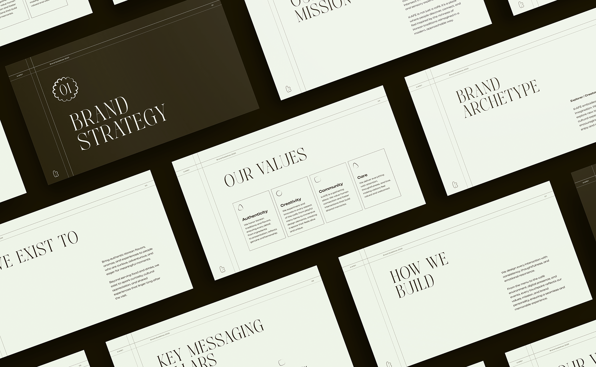
The first challenge in shaping K-AFE was defining its brand strategy. The café market is crowded with trendy spots competing for attention with similar aesthetics, “Instagrammable” corners, and short-lived design trends.
The real risk was creating yet another space that looked good but felt forgettable.
My objective was the opposite: to build a brand that didn’t rely on visual gimmicks, but on genuine storytelling. A brand rooted in Korean culture, yet expressed through a fresh, contemporary lens. I wanted K-AFE to feel authentic, warm, and imaginative, something people would remember not just for how it looked, but for how it made them feel.
My objective was the opposite: to build a brand that didn’t rely on visual gimmicks, but on genuine storytelling. A brand rooted in Korean culture, yet expressed through a fresh, contemporary lens. I wanted K-AFE to feel authentic, warm, and imaginative, something people would remember not just for how it looked, but for how it made them feel.
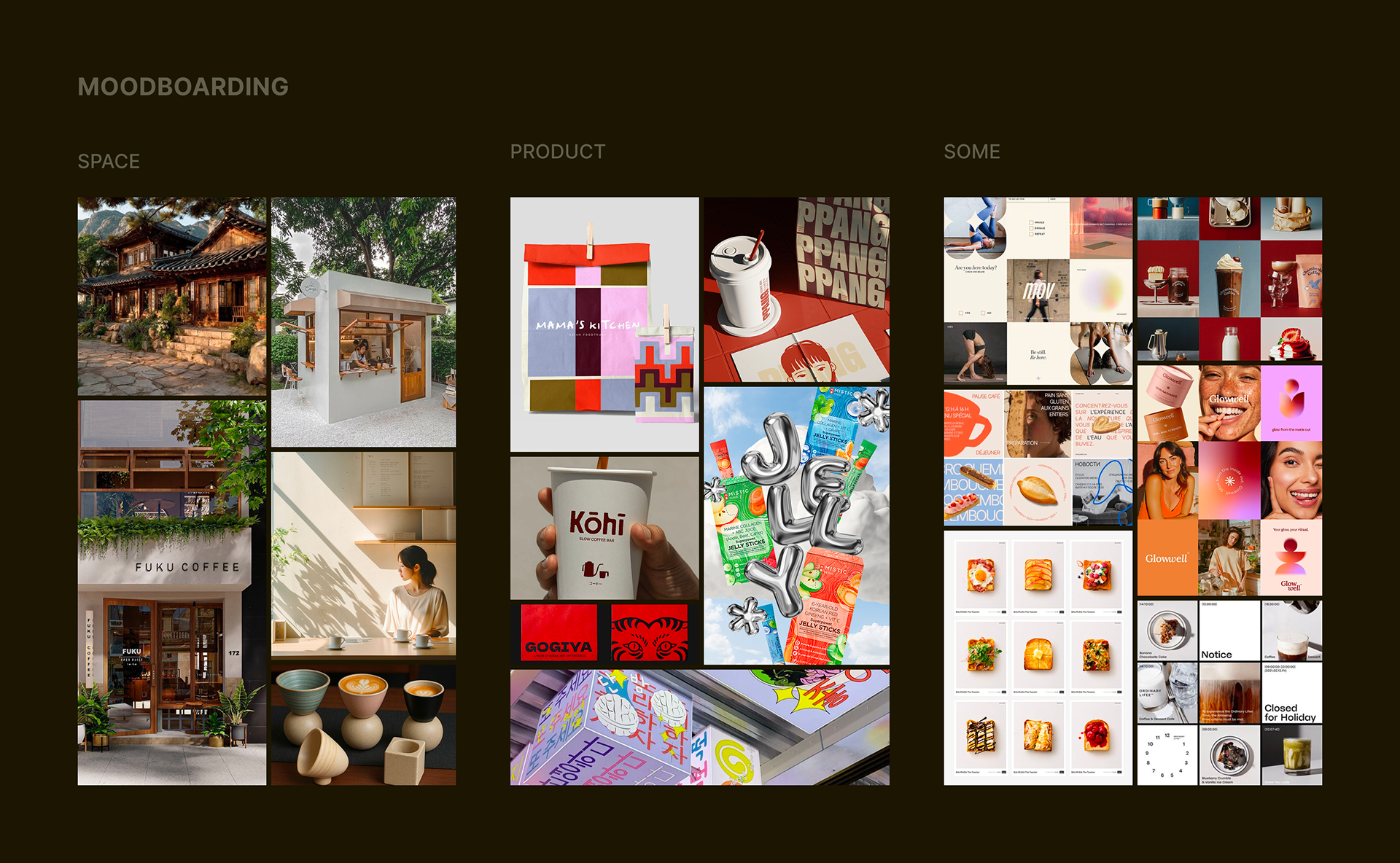
The research
Before bringing the identity to life, I carried out a deep research phase to define the visual and experiential direction of the brand. I built multiple moodboards exploring references related to atmosphere, branding, food presentation, interior design, and merchandise.
I studied materials, textures, color palettes, vegetation, lighting, and spatial layouts to understand how each element could contribute to a cohesive environment. This exploration helped me shape a brand that feels rooted in culture, consistent across touchpoints, and aligned with K-AFE’s promise: a place where tradition and modernity meet naturally.
This research phase became the foundation for every design choice that followed, from the logo to the iconic shapes, the photography style, and the color system.
Visual Identity Rationale
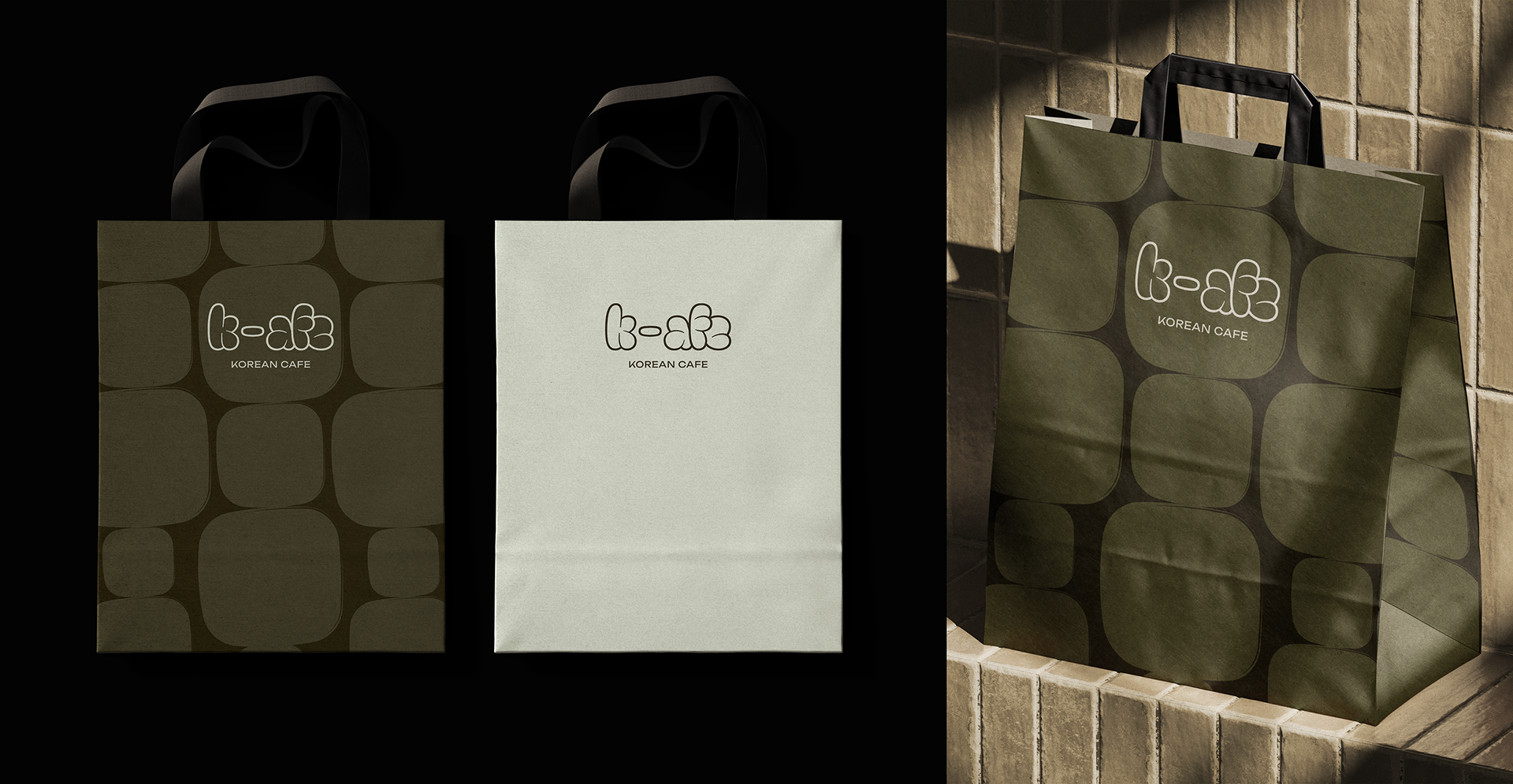
Logo & Typography
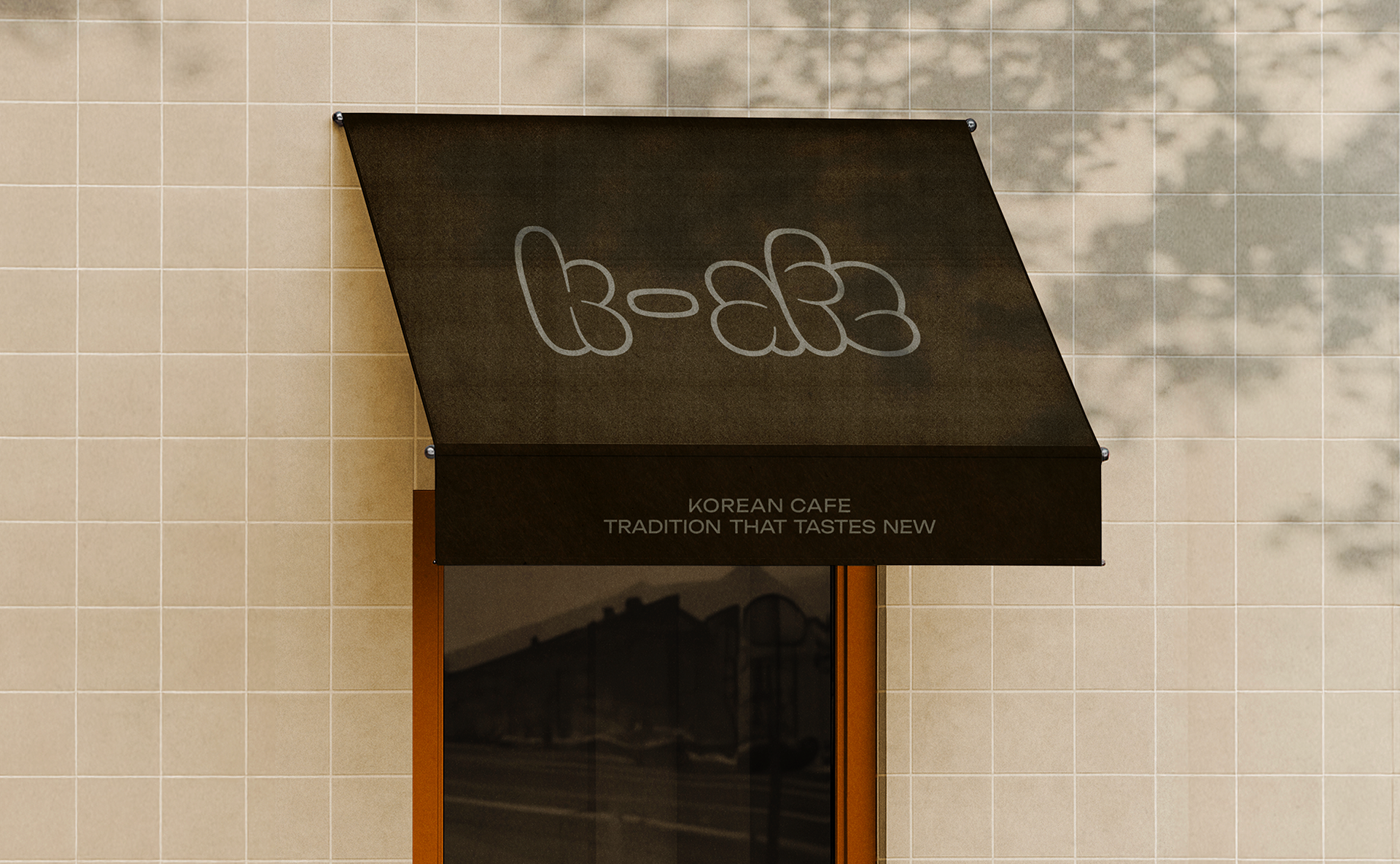
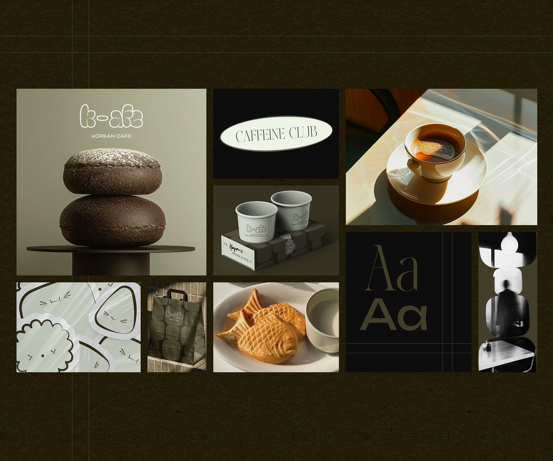
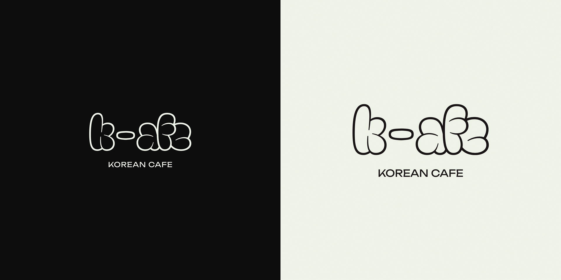
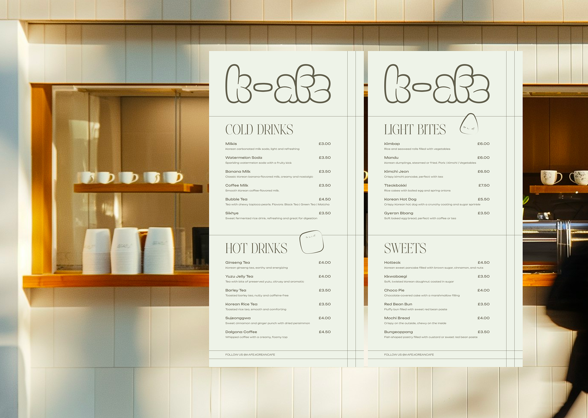
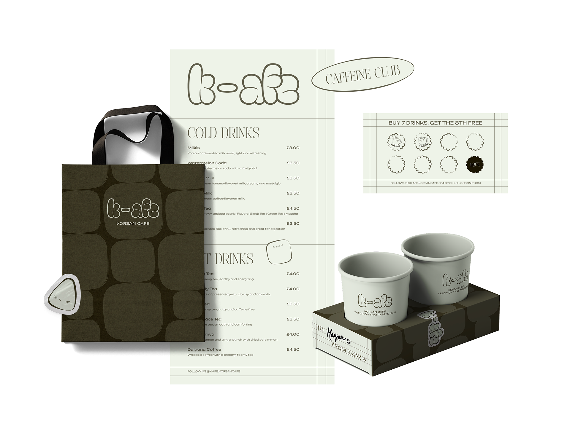
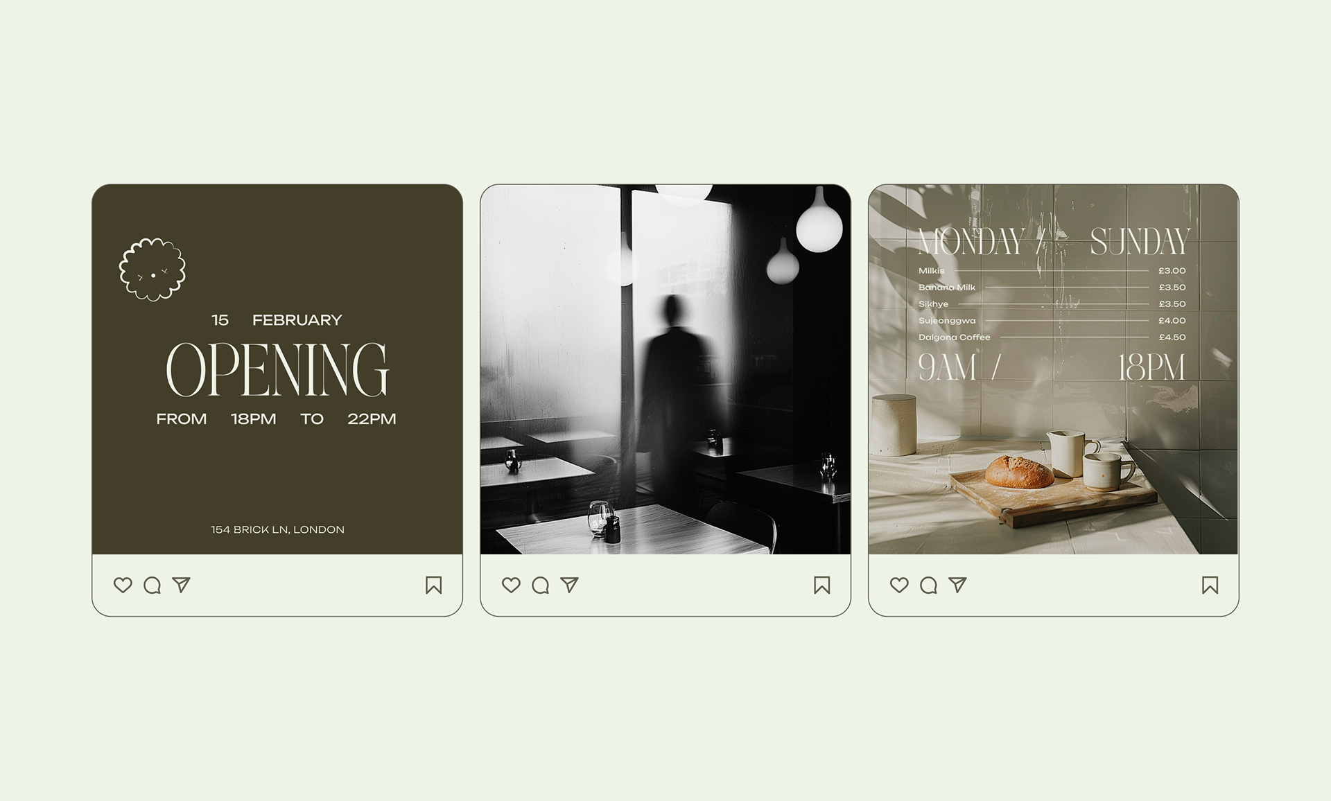
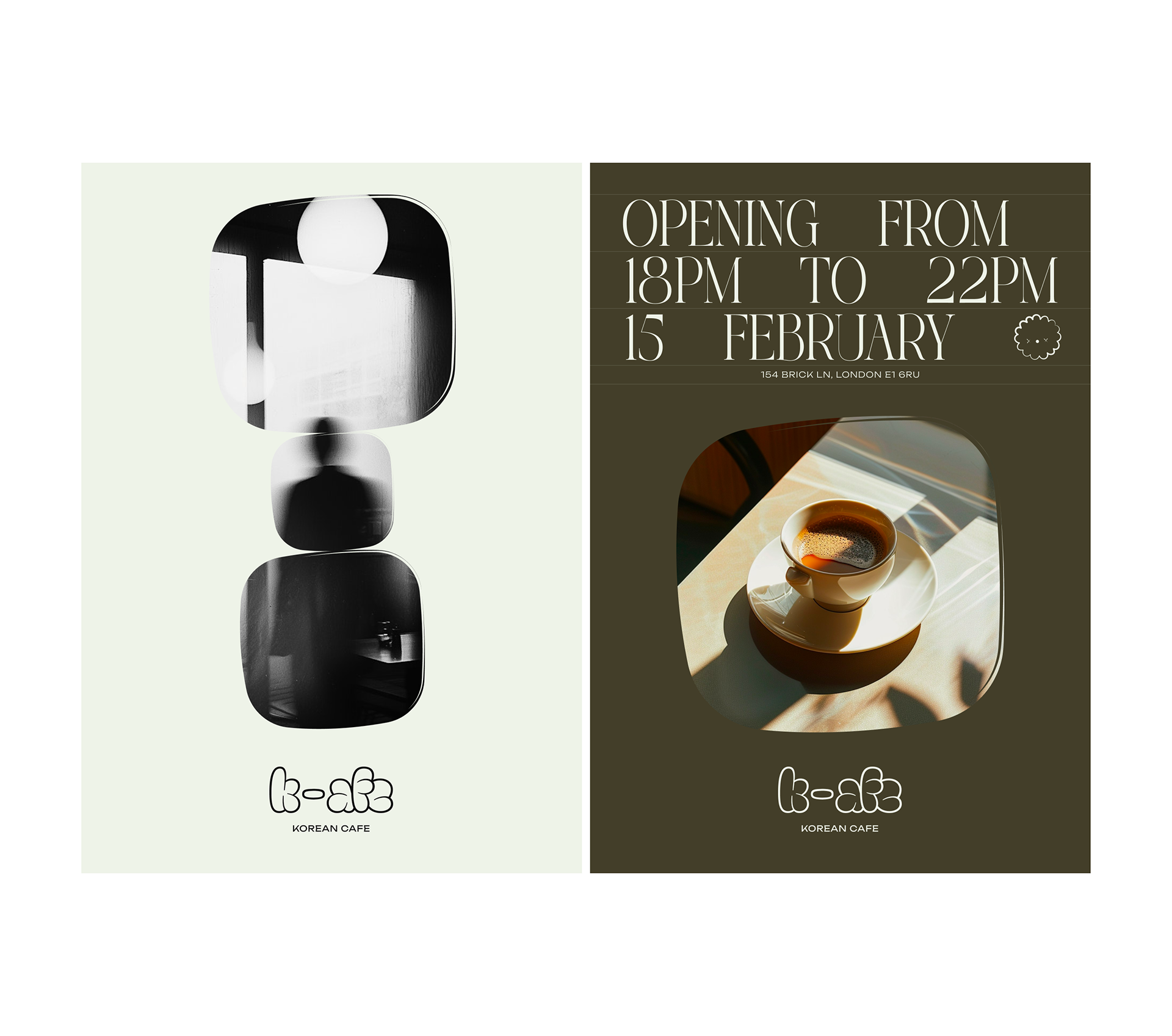
For the logo, I chose “Throwup”, a soft, rounded typeface that adds a subtle spongy quality. Its bubbly forms echo the texture of Korean sweet pastries, giving the identity a gentle gourmand character without feeling childish.
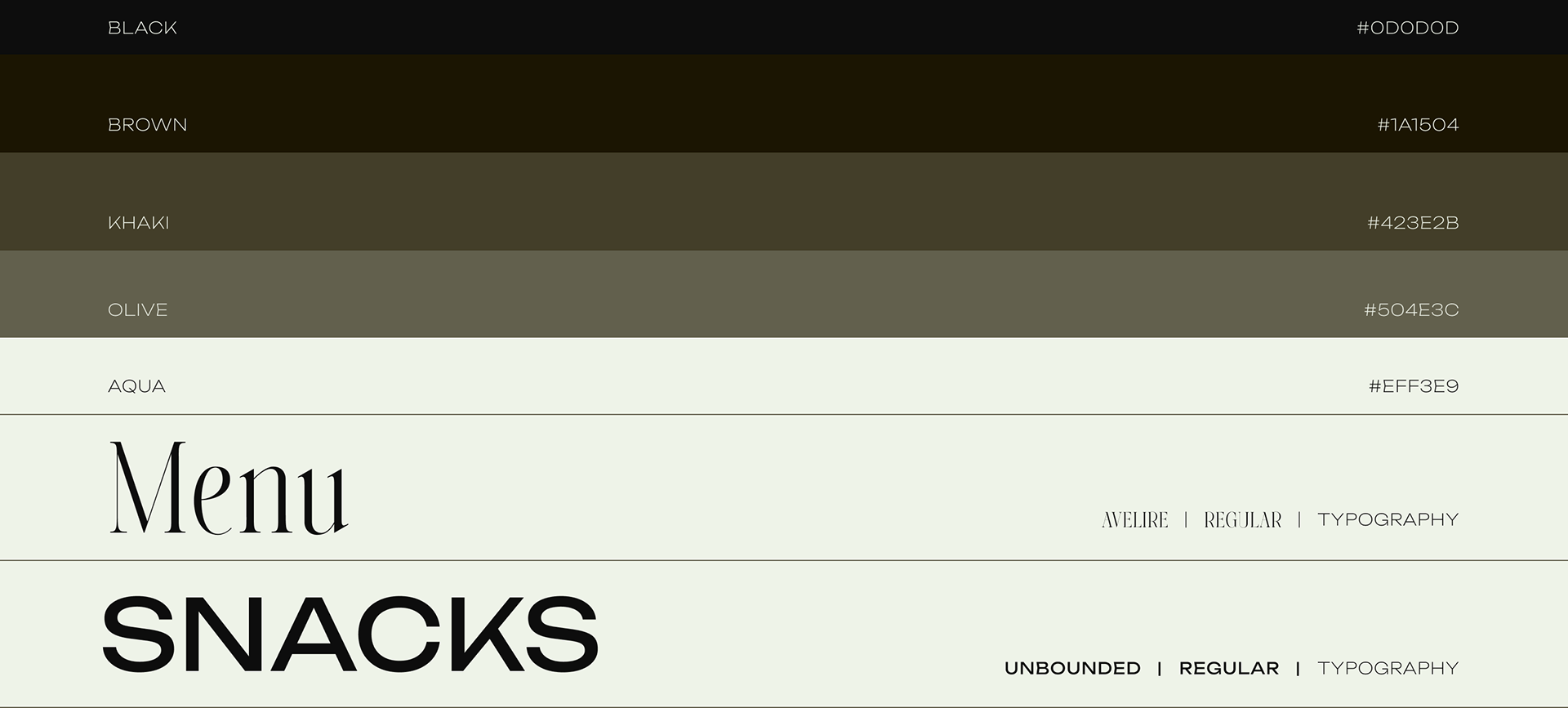
For typography, I paired “Avelire” as the primary font, classic, refined, and warm, with “Unbounded” as a secondary, more expressive typeface. Together, they create a visual voice that feels elegant and playful.
Color Palette
The color palette is warm, earthy, and grounded. It reflects the richness of coffee and the calm, welcoming mood of the brand.
Beyond aesthetics, the palette draws inspiration from traditional Korean architecture: deep woods, muted greens, natural stones, and organic materials found in hanok houses.
This connection gives the identity cultural depth while maintaining a modern and minimalist sensibility, timeless rather than trendy.
For the logo, I chose “Throwup”, a soft, rounded typeface that adds a subtle spongy quality. Its bubbly forms echo the texture of Korean sweet pastries, giving the identity a gentle gourmand character without feeling childish.
For typography, I paired “Avelire” as the primary font, classic, refined, and warm, with “Unbounded” as a secondary, more expressive typeface. Together, they create a visual voice that feels elegant and playful.
Color Palette
The color palette is warm, earthy, and grounded. It reflects the richness of coffee and the calm, welcoming mood of the brand.
Beyond aesthetics, the palette draws inspiration from traditional Korean architecture: deep woods, muted greens, natural stones, and organic materials found in hanok houses.
This connection gives the identity cultural depth while maintaining a modern and minimalist sensibility, timeless rather than trendy.
Visual Identity Rationale
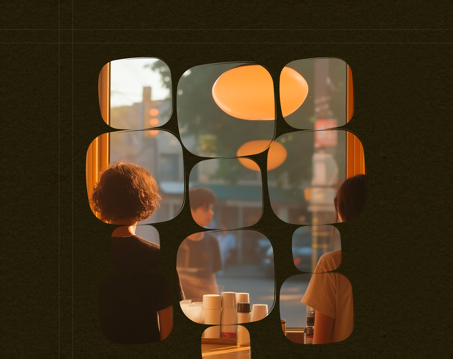
Illustration & Photography
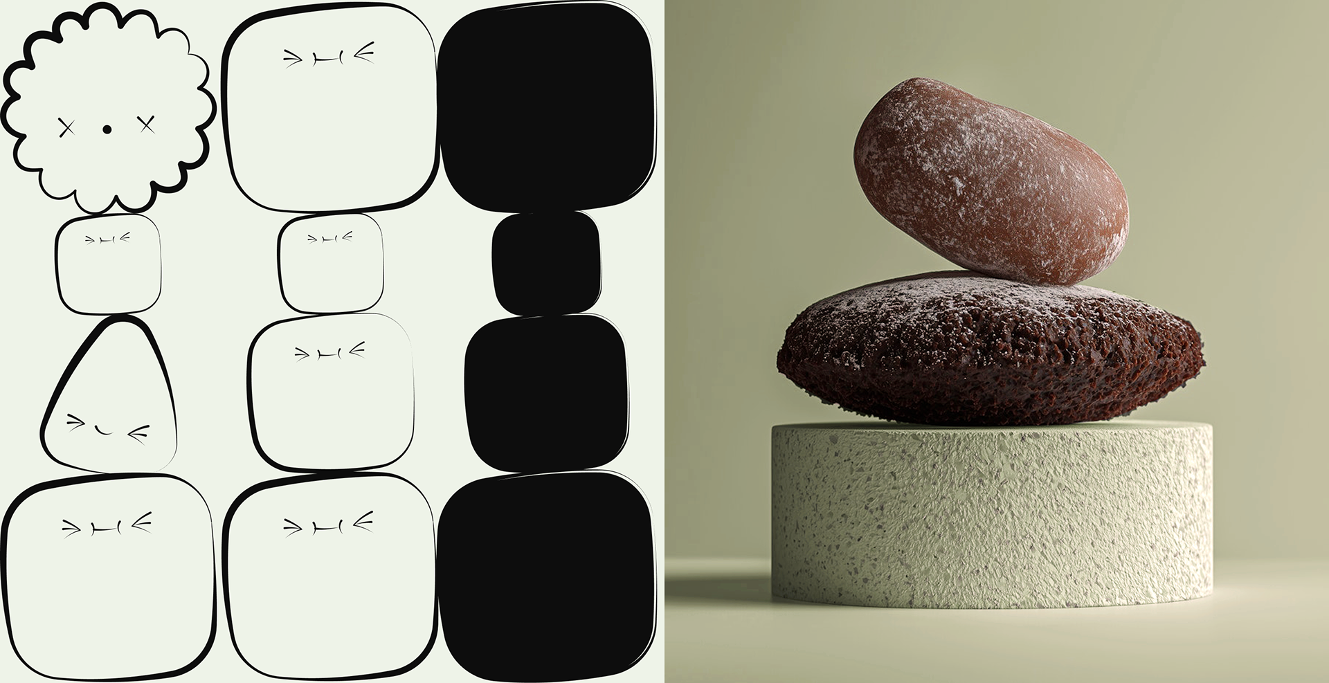
The visual language combines playful illustration with refined, contemporary photography.
The illustrations take inspiration from the cute, rounded silhouettes found in Korean pâtisserie, mochi buns, soft bread, fluffy cakes, translated into stylized, minimal characters that feel expressive but not childish. Their simple shapes carry warmth, charm, and a sense of approachability.
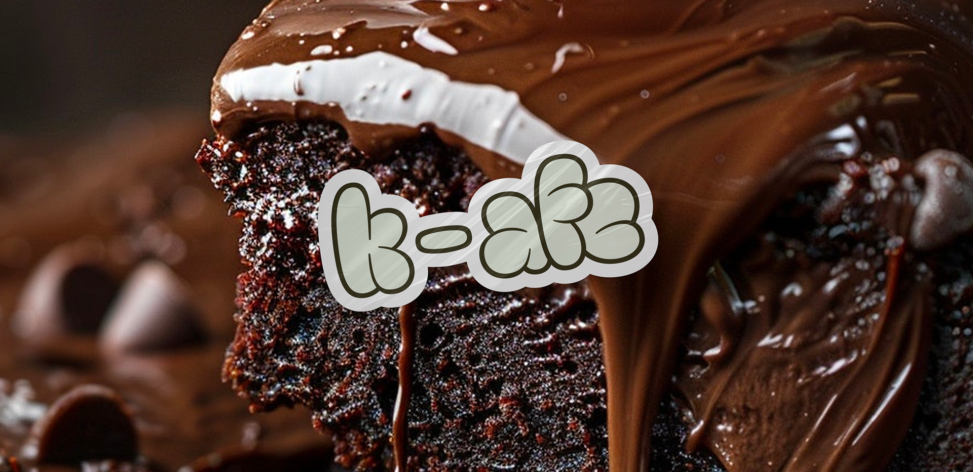
Photography complements this with a clean, sculptural approach. Still-life compositions are stacked and balanced, subtly referencing the harmony between tradition and modernity. These calm, architectural shots are paired with close-up, gourmand photographs that highlight rich textures and irresistible flavors, ensuring the brand never loses its sensory, delicious side.
The visual language combines playful illustration with refined, contemporary photography.
The illustrations take inspiration from the cute, rounded silhouettes found in Korean pâtisserie, mochi buns, soft bread, fluffy cakes, translated into stylized, minimal characters that feel expressive but not childish. Their simple shapes carry warmth, charm, and a sense of approachability.
Photography complements this with a clean, sculptural approach. Still-life compositions are stacked and balanced, subtly referencing the harmony between tradition and modernity. These calm, architectural shots are paired with close-up, gourmand photographs that highlight rich textures and irresistible flavors, ensuring the brand never loses its sensory, delicious side.

Final thought
My goal was to design a brand that didn’t simply follow trends, but created an authentic, memorable experience. With K-AFE, I explored how cultural grounding, playful storytelling, and modern simplicity can coexist to form a brand that feels both familiar and new, something that stands out not because it tries to, but because it genuinely connects.


K-AFE Brand Design 2025


